
That Certain Colour of Light!!
We are ready for the sunshine - for sure! We have been under a proverbial cloud for so long now, but I for one, do see some light coming at the end of the tunnel, with the news of the vaccine, springtime around the corner, our world beginning to open again this year, and our economy coming back. I have been sending my clients some inspiration to help get ready, and welcome that unique light in the early spring - clear and warm light.

Montmartre Settee by Ebanista
Above; The super clean lines of the Montmartre Settee by Ebanista, and the graphic on the floor set up a great and solid foundation to play against the soft undulations and folds of the custom designed Roman Shade - and of course the gilded mirror. While this is a great opportunity to talk about tension in a room (and we have ALOT of wonderful positive tension here!) the main idea is the contrast with the two physical forms of geometric vs. organic lines. In thinking about the colour of light in this room, the walls have been left in a very neutral colour that amplifies the light in the room without adding alot of colour.

Above; The same idea of counterpoint, or tension exisits with the clean lines of the marble topped vanity, the clean windows and window treatments, the graphic outline in chrome of the mirror and shower enclosure. Contrasting with the crystal chandelier and it’s delicacy plays very well with the weight and gravity of the furnishings in the room. The colour of the walls again, speaks to letting a light-filled room use up the light, and bounce around.

Above; a beautiful arrangement of soft blue and pearl colours, in the same fashion of letting the light do the real work, and keeping the colours softer and quieter than you might think. In yet another example of counter-play, the graphic lines of the mouldings, the fireplace surround and the window all are softened by the window seat cushion and pillows very softly made up, and the draped Roman Shade which is relaxed.
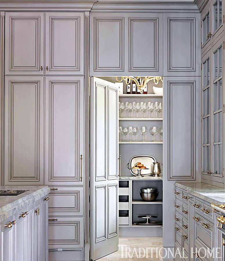
Above; Now in this case, we have no fooling around - just alot of good geometric mouldings going on. Again with the colour of the light, the reveals, the trim, the mouldings and cabinet insets all are highlihted by the light doing it’s work; with light and shadows. The softening effect is accomplished with the unique and soft grey/blue colour of the cabinetry, that carries on through to the butler’s pantry.

Above; Without furnishings, this is a not-often-seen example of letting light and shadow do the heavy lifting for us. The room will likely have furnishings that will accomplish the softening, but for now we see the details all the more clearly for the soft neutral colours of the paint as the counterpoint for the shadow lines of all the millwork and mouldings. Note the trim and doors and the niche are a light off-white, and the walls are a shell grey, and the upper crown mouldings are painted the same colour as the walls.

Above; there is nothing like the soft folds of gently starched cotton that grace a bed, and are touched by sunlight. This is all about the light, and the fresh and clean feeling we can get from light - especially in the springtime!